In the ever-evolving world of interior design, a significant shift is underway as homeowners and designers alike move away from once-popular color schemes that now feel harsh, outdated, or overly cool. By 2026, experts predict that combinations like yellow and burgundy or teal and white will be completely phased out, replaced by warmer, layered palettes such as taupe, butter yellow, and deep navy. This transition reflects a growing desire for home spaces that feel inviting, expressive, and less driven by fleeting trends, emphasizing a cozier, more refined aesthetic that prioritizes emotional comfort over bold statements. As Laura Waterson, general manager at Koehn Painting, notes, the trend now centers on warmth and depth, signaling a move toward colors that create a harmonious sanctuary rather than a jarring visual experience.
Why Are Certain Color Combinations Falling Out of Favor?
Designers highlight several outdated pairings that are losing their appeal. For instance, yellow and burgundy often feels dated and overwhelming in daily living spaces. Isabella Patrick, founder of Isabella Patrick Interiors, explains, "Yellow and burgundy is not one of my favorite combos—it usually feels outdated." Instead, she suggests toning down the saturation with alternatives like pale cream and burgundy for a less abrasive look.
 :max_bytes(150000):strip_icc():format(webp)/GettyImages-76504067-7b7cf645a7ba4b97abd43bc27afdbfa0.jpg)
Similarly, pink and lavender pastels can quickly become tiresome and whimsical. Laura Waterson advises against this pairing, recommending fresher contrasts: "Better alternatives include baby pink with cool green accents or pairing pink with bold hot pink for a fun monochromatic direction." This approach avoids the dated feel while maintaining vibrancy.
People Also Ask: What makes a color combination feel outdated? Experts attribute it to oversaturation, lack of warmth, or clash with current preferences for layered, inviting hues.
Top Outdated Combinations and Their Modern Replacements
Here's a breakdown of the key color schemes to avoid and their 2026-ready alternatives:
| Outdated Combination | Why It's Phasing Out | Modern Alternative | Expert Tip |
|---|---|---|---|
| Yellow and Burgundy | Feels harsh and dated; too primary-colored | Pale cream and burgundy | Isabella Patrick: "Opt for softer shades to reduce jarring effects." |
| Pink and Lavender | Quickly becomes whimsical and tired | Baby pink with green accents or hot pink | Laura Waterson: "Go monochromatic or add fresh contrasts for longevity." |
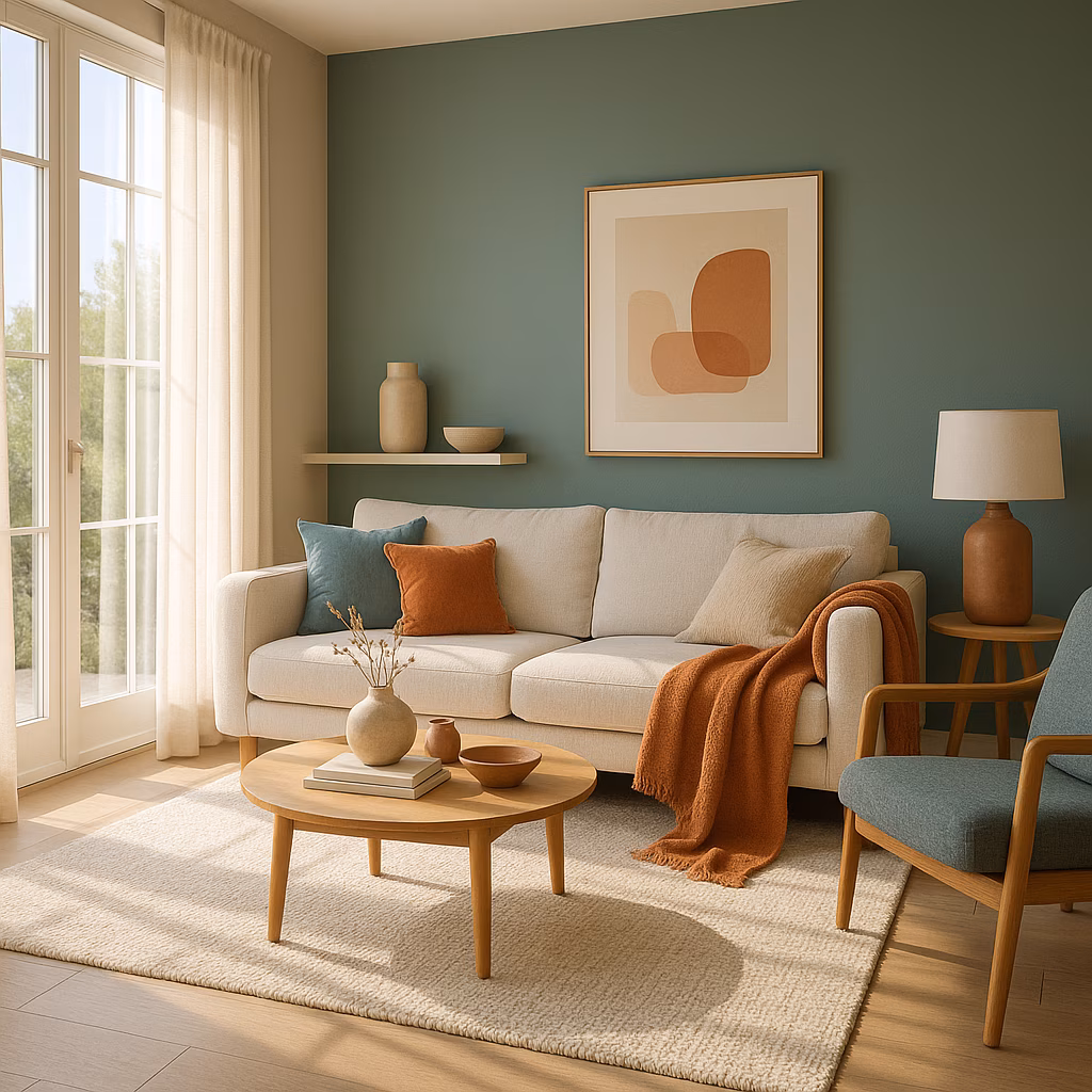
| White and Teal | Too bright and cool; lacks warmth | Warm whites with fern green and buttery yellow | Laura Medicus: "Layer colors like olive and navy for sophistication." |
| Brown and Burgundy | Clashes and feels heavy | Color-drenching with bold red or complementary shades | Waterson: "Paint ceilings and walls for a modern finish." |
| Greige (Gray/Beige) | Flat, cold, and energy-sapping | Taupe, milk white, or butter yellow | Waterson: "Choose warm tones like chartreuse for energy." |
For the white and teal duo, Laura Medicus, principal designer at Laura Medicus Interiors, emphasizes its decline: "The trend now is all about warmth, depth, and unexpected color combinations." She advocates for palettes like earthy olive paired with deep navy to create inviting, playful layers.
:max_bytes(150000):strip_icc():format(webp)/GettyImages-1543932935-76659a1235cf4679b82b33957acccb25.jpg)
Brown and burgundy also makes the list of avoidable schemes. Waterson warns against this combo, suggesting doubling down with color-drenching: "If you opt for bold red, paint the ceiling too and choose accessories in the same shade." This embraces current trends while avoiding clashing darkness.
Embracing Warmth and Depth in Modern Palettes
Neutrals aren't immune to obsolescence either—greige (a mix of gray and beige) has been draining energy since the 2010s. Waterson describes it as turning homes into "low-energy gray boxes," leading to flat, cold spaces. Instead, she promotes warmer hues: "Opt for taupe, milk white, or butter yellow—they offer more warmth without overwhelming." 🎨 Alternatives like champagne or chartreuse add vibrancy subtly.
People Also Ask: How can homeowners test new color schemes without commitment? Experts suggest starting with accent walls or accessories to gauge the warmth and layering effects before full-room changes.
:max_bytes(150000):strip_icc():format(webp)/GettyImages-13997451021-9fc66b56f73c4a32a04e28f1a659d13d.jpg)
To implement these shifts, consider these key steps:
-
Assess current schemes: Identify if your space uses any outdated combos like those listed.
-
Layer warm tones: Start with taupe or navy as base colors, then add accents of butter yellow for coziness.
-
Experiment gradually: Use throw pillows or rugs in modern alternatives before repainting.
-
Consult experts: As Medicus puts it, "It’s all about creating layers that feel inviting and sophisticated."
The Future of Home Color Trends
Looking ahead to 2026, the emphasis remains on creating expressive, less trend-driven environments. This shift isn't just about aesthetics—it's about fostering homes that feel like sanctuaries. But are we truly ready to leave behind the flashy combos of the past? As the design world embraces warmth and refinement, the question becomes: How can we ensure our spaces evolve with these insights? Ultimately, this movement circles back to the core desire for inviting, personal havens, proving that a simple paint change can transform a room from outdated to extraordinary.